OVERVIEW & BACKGROUND
SeaMoss Transformation began the branding of their products & ecommerce store with the vision of becoming a leading brand in the health and nutrition market.
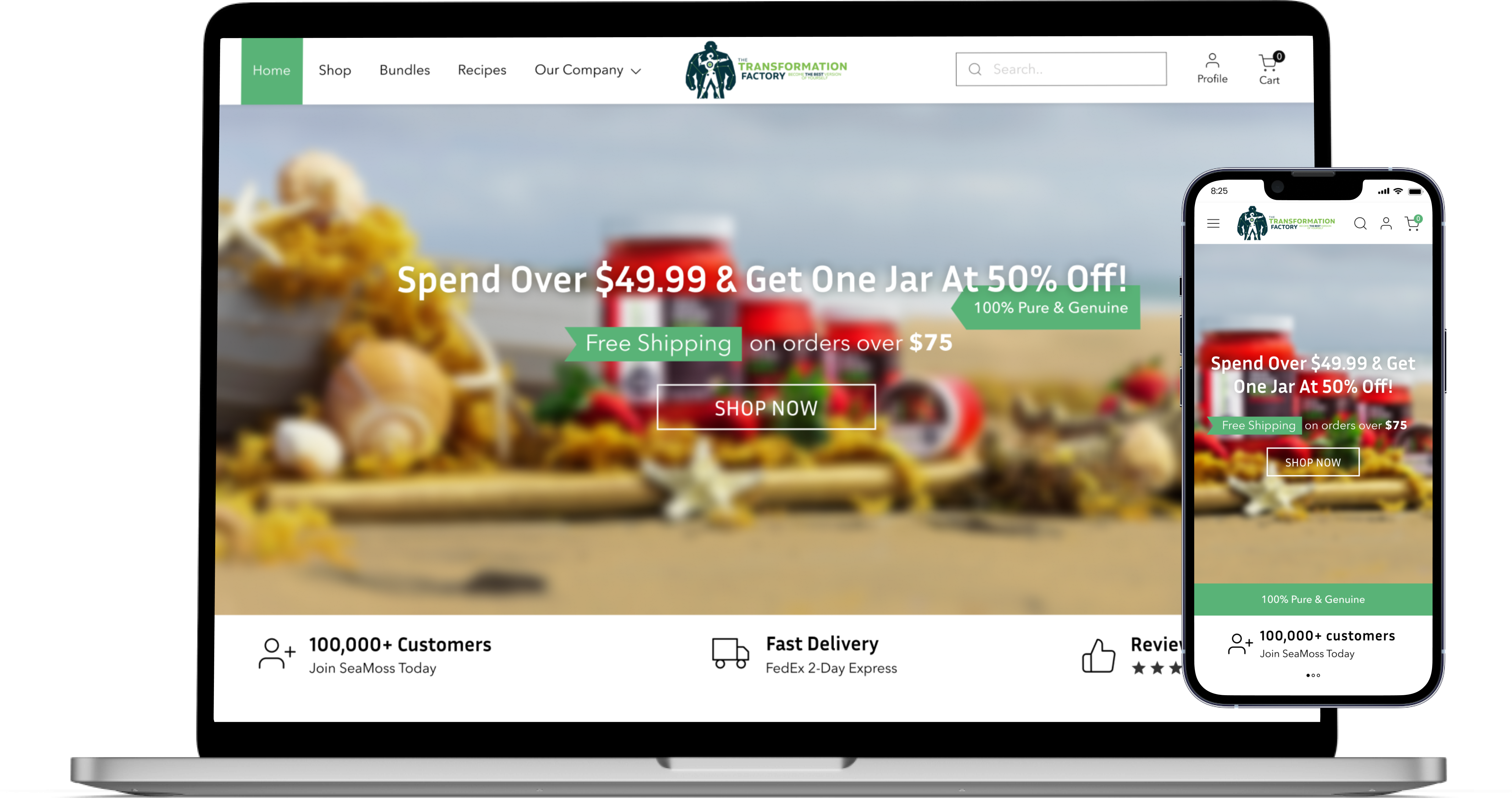
The goal was to redesign their website using proper style guide 🎨 while improving the user experience & conversion rate on their homepage and product page for customer engagement.
ROLE & TIME
UI/UX Designer
interaction Design, Visual Design, Wireframing, Prototyping Style Guide, UI Kit
Nov 2021
- 50+ percent of the traffic on the web comes from mobile phones and we didn't have a responsive website.
- Website was very inconsistent and didn't give a vibe of a brand who wants to lead the market.
- No imagery of brand on the homepage didn't give an organic brand vibe.
- No social proof for the product being good.
- No customer engagement on the product page to suggest more products to users.
♻️ The Process
We did ux audit & looked at the data and uncovered some pain points felt by individuals. It was revealed that:
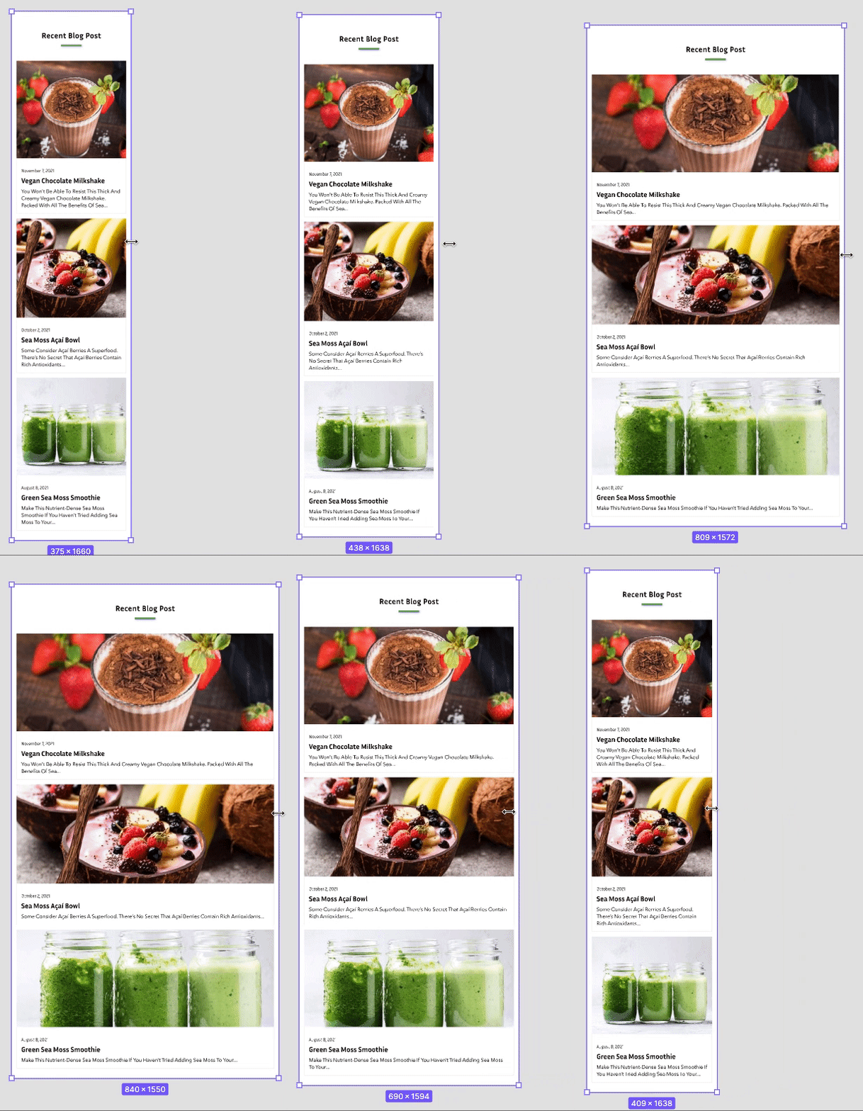
- We need a responsive website specially targeting mobile phones to increase traffic coming from smaller devices.
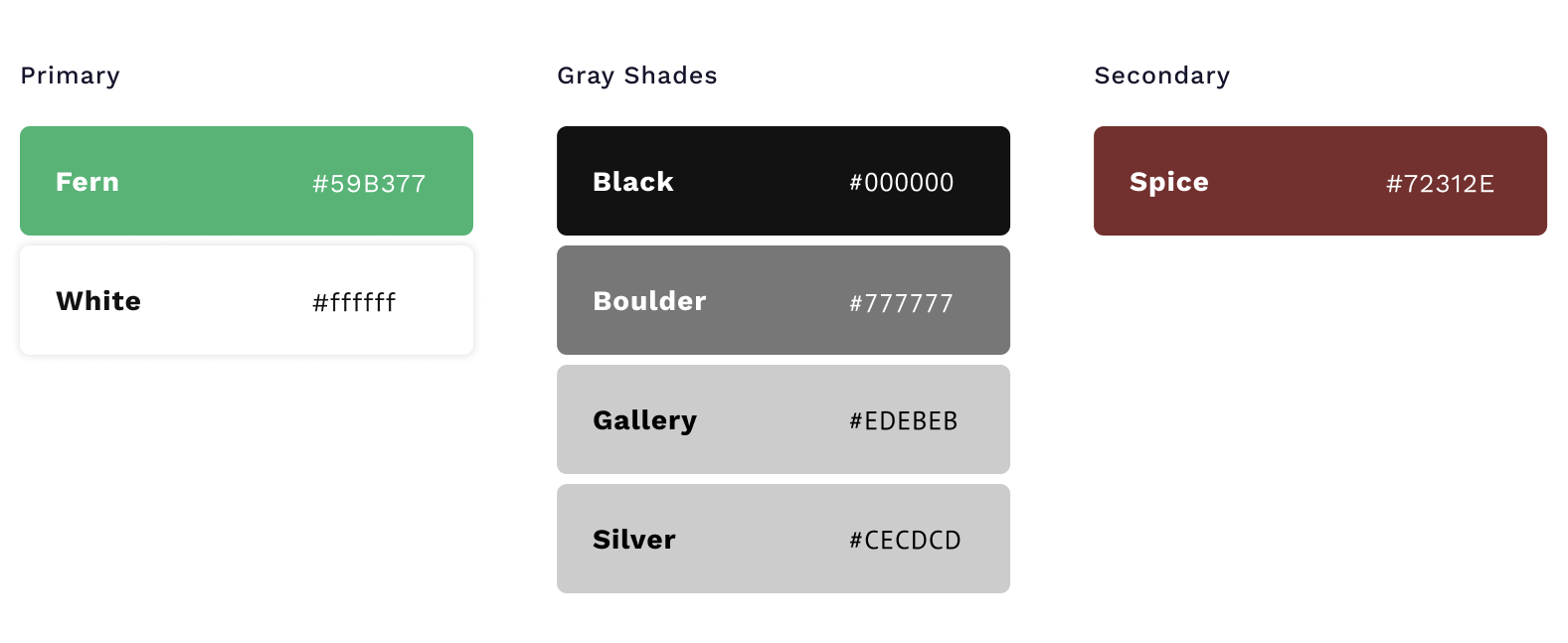
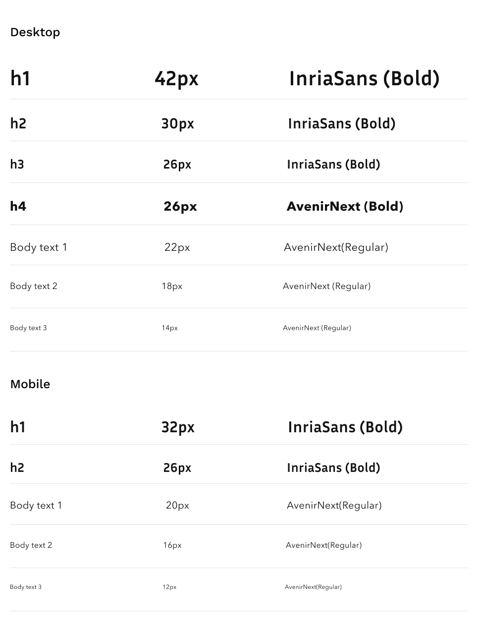
- We need a style guide to redesign clean, simple and friendly website based on brand values.
- We need to add an instagram post section to give a sense of community and originality.
- We need to add Blog section on homepage to promote health through SeaMoss.
- we need to use product images throughout the website to develop brand value.
- We need to add a customer testimonials section on homepage & reviews section on product page to increase trust of customers by social proof.
- We need to add a “You may also like” section at the end of the product page to engage customers into buying more products.
💡 Product Vision and solution
We did some market research on competitors to investigate the current market and take inspiration from some of their features as well as saw website data and identified where we’re lacking . From these findings, we identified some key business goals:
🧱 Defining Initial Solution
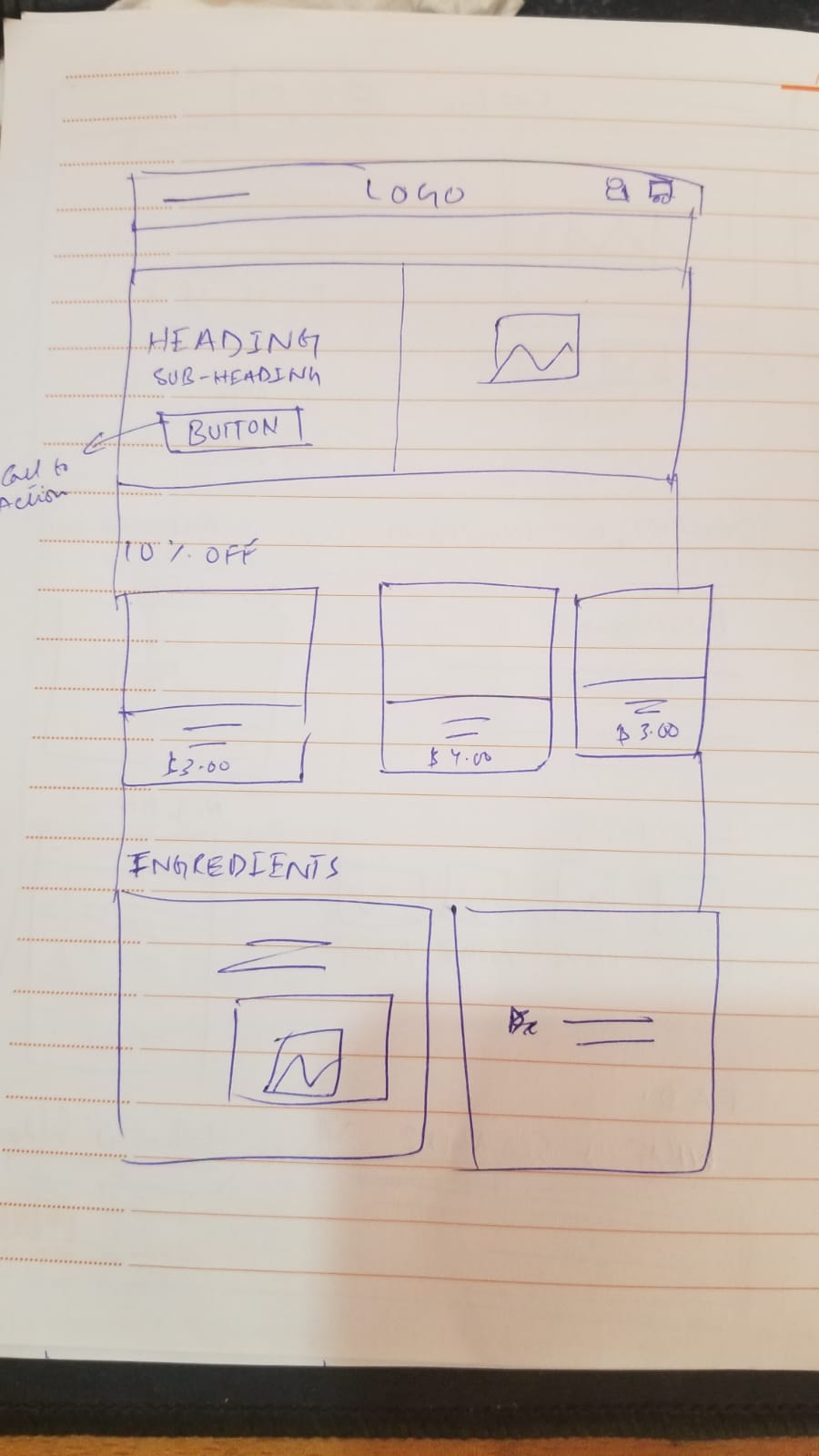
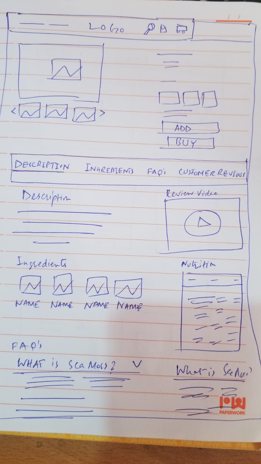
We did some sketching/wireframing sessions and presented to the stakeholders and told them how these solutions can improve the overall conversions & user experience aligning with the business goals.
Rough Sketches
Homepage initial
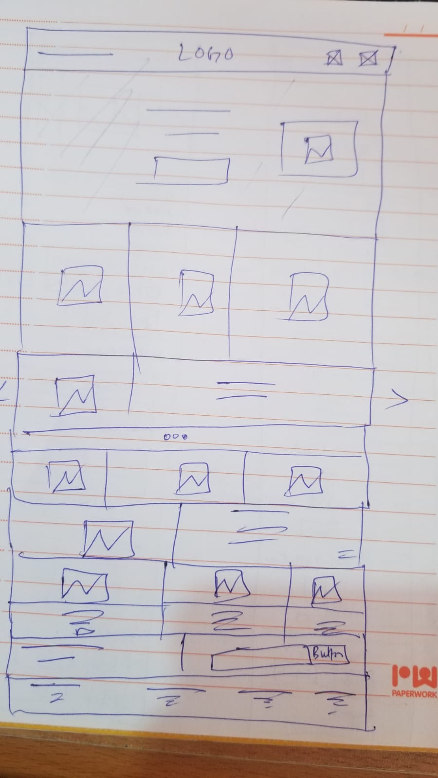
Homepage
Productpage
Wireframes (Web)
Home Page

Product Page

Wireframes (Mobile)
Home Page

Product Page

After some iterations of the product page & Homepage, we were able to get approval for the design. Inorder for the developer to start the work on architecture, I created the prototype of wireframes and shared them with him.
After making a style guide, we shared it with the developer to start implementing them as well as the redesigned screens after that.
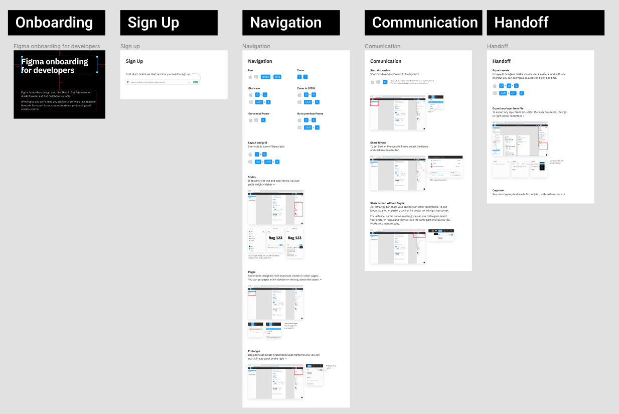
🛫 Developer Handoff
I have an onboarding process for developers on Figma, which gives them an in depth rundown of everything they need to know to export design from Figma.
- Focus on the problem : Even though it is important to make the design much cleaner and modern, in the end it is the users pain points that are the priority to solve first.
- Good results come from collaboration: bringing team members to the brainstorm always highlights things that you probably are missing, so it is always good to do it as it solves problems much quicker and much better.
- Design Thinking & Process is effective : This basic process of ideating, defining & prototyping really helped me focus on the problem and get to the solution quickly.
Since the implementation of the new design, we have seen a significant increase in the number of sales and increase in a traffic from mobile phones.
Some key takeaways from this project are:
